10 unusual metaphors in the icons design
#1 Windows 3.11
Let's start with a distant 93 years, when Windows 3.11, which was one of the most beautiful interfaces in the history of the operating system. You can see that the designers have worked with great love and diligence. They paid much attention to details and nuances.
Windows 3.11
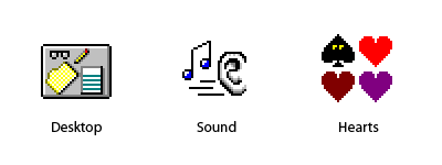
- Desktop - Once is not drawing the desktop in different operating systems! In my opinion, this is the most fun and exciting. But these reflections on the glasses!
- Sound - In ikonochnom fact very often used the image of hands. And the ears - are rare.
- Hearts - How sweet: peaks with eyes! We do not do that.
#2 OS/2 Warp 4
In OS / 2 Warp 4 issues of 1996 appear three-dimensional icons, which are gradually being included in vogue. But the framework is still the same - pixel icons in 16-color palette.
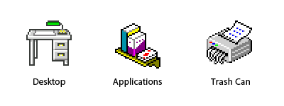
- Desktop - Green Lamp subdued my heart. But in general, once made a desktop icon psevdotrehmernoy, the desktop itself and it was necessary to do so. :)
- Applications - A folder with attachments - a very complicated icon and obscheupotrebimoy metaphor for it is not thought of until now. Designers interface OS / 2, agreed that the shelf with a box / book and a deck of cards - what you need!
- Trash Can - Attentive readers will recall, as I cursed this icon in the article «10 errors in the design icons». But the metaphor is indeed unusual, and very likeable Schroeder.
#3 BeOS R5
When there is a new generation of multimedia OS, many had pinned great hopes on it. In the end, however, failed, but it is not important. So, in 2000, went BeOS R5, which has been decorated with one of the most unusual images.
BeOS R5

- Desktop - again a green light! With such a solid and realistic «table» interface might have to do is fully three-dimensional!
- Browser - The term «web surfing» prizhilos, but the icon with a metaphor and remained exotic. A pity!
- File Manager - They like to say to us: «It helps to search for files!» Very funny metaphor. The truth is, I would not like the dog-manager navodil order in my documents - dogs are rarely successful.
#4 Mac OS X Automator
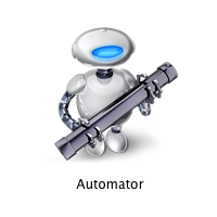
Our days. Well, almost. 2005. Robots! Robots! Robots!
Automator
Program Automator allows you to create scripts to automatically run it. For the first time, this assistant appeared in Mac OS X Tiger. Rare stroke of luck, if on the icon you can understand what makes the program. Compare with other okoloskriptovymi programs - scrolls and buttons with strelochkami. (phew!)
#5 VLC Media Player
Prior to that, we looked at «home» icons operating systems. This video player is not part of the operating system, but taking into account the prevalence of VLC Media Player, it can also be regarded as «standard».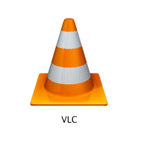
According to the icon is very difficult to guess what makes the program. But a metaphor for something unusual! I tried to find out why VLC developers chose it on a road cone. History is quite strange. It turned out that the developers (students École Centrale Paris) is a collection of cones. In honor of this, and an icon.
#6 Mac OS X Front Row
Front Row native media player of the Mac OS X in the style of Apple TV. This is not even today, and the future.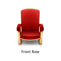
Also interesting case. Why a chair? According to the icon was not clear what makes the program, but it reflects the essence of the process: «Usazhivaysya sit back and watch the movie!» In general, icons of different media players, the problem with a single metaphor. I do not think that in the near future to change it.
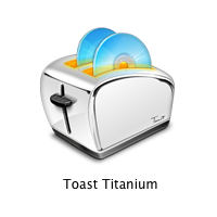
#7 Roxio Toast
Roxio Toast - in fact, the standard program for wrighting CD under Mac OS X. Fortunately, unlike in this toaster, disks are not burn!
One of the most brilliant metaphors in the history of ikonkostroeniya. Toaster is much more understandable and appropriate metaphor than the standard icon of radiation. At kartike represented by an icon Roxio Toast 7, the appearance tostera changed from version to version.
#8 Transmit
Transmit - ftp-client for Mac OS X. The icon reminds me of gikovskoy problem: «truck from point A to point B transported five tons of dvd-ROM drive. What will be in this case, the data transmission rate? »
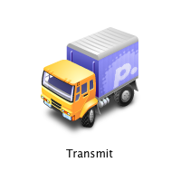
This program is a widget, if you drag a file on him, then he has his «otvozit» on the imaginary road in the pre-specified location. So cute!
#9 Twitterrific
Twitterrific - Client program for regular classes mikroblogginogom through Twitter.
I have little in birds, but let me suggest that the icon is drawn sparrow. The point is that in English «tweet» means «chirm» or «chirp». Here is a bird and chirikaet. So simple, but original.
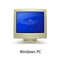
# 10 icon computer with Windows in a networked environment, Mac OS X
If you use a poppy, but there is a network PC - you can share files and printers to share. This is good news. But there is a nuance.
Windows PC
That's what the icon looks like a computer with Windows in a networked environment, poppy. Designers Гусары Apple poshutili thin, but a bit raw.
At the same time, I finish my review. I do not like, but I turned off in the direction of programs for Mac OS X. Unfortunately, I did not find any interesting icons in Windows Vista. Plus, I deleted the little-known icons of programs. I would be very grateful if you send me (or write in comments) Other examples of icons with unusual metaphors.
Origin article.
Labels: icons, web design
posted by Design for Money at
4:16 PM
![]()


0 Comments:
Post a Comment
<< Home